Discover how to create pharma marketing materials that actually work—brochure designs, real-world tips, and witty wisdom included!
When it comes to pharma marketing materials, it’s tempting to slap on a molecule model, sprinkle in a few graphs, and call it a day.
Now let’s be honest—no one ever said, “Wow, this brochure changed my life!” after reading a clinical trial summary printed in 8-point font on a glossy foldout.
However, with the right strategy, and a healthy dose of creativity, you can make brochures, leave-behinds, and digital assets not just informative, but also irresistible.
So, buckle in. Whether you’re wooing physicians, winning over payers, or wowing patients, here’s how to make your pharma brochures design feel less like a wall of data and more like a conversation worth having.
1. Know Thy Audience
Remember, your brochure isn’t about the molecule. It’s about the person reading it.
A nephrologist? They want data. A patient? They want hope. A pharmacist? They want dosing info without digging through a forest of footnotes.
Real-life tip: When Genex Biotech launched their biologic for rheumatoid arthritis, they created three brochures for the same drug: one technical, one emotional, and one economic.
Guess what? Engagement tripled. So yes, customizing works.
2. Design Like a Human, Not a Spreadsheet
Ever seen a tri-fold brochure that feels like someone copied and pasted a white paper? That’s a design crime.
Good pharma brochures designs use whitespace, hierarchy, and colour with confidence.
Bold headlines? Yes. Easy-to-skim bullet points? Absolutely. Icons instead of walls of copy? You bet.
Pro tip: Stick to the “3-second rule.” If someone can’t tell what the drug does, who it’s for, and why it matters within 3 seconds of opening your brochure… back to the drawing board.
3. Use Words That Don’t Require a Degree in Biochemistry
Pharma is a science, but marketing is storytelling. Replace “therapeutic area” with “disease type.” Trade “adverse event profile” for “potential side effects.” The goal isn’t to dumb it down, it’s to make it digestible.
Real-life win: One startup swapped “non-inferiority trial” for “just as effective as the standard treatment” in their physician-facing materials. It literally improved rep recall scores by 40%.
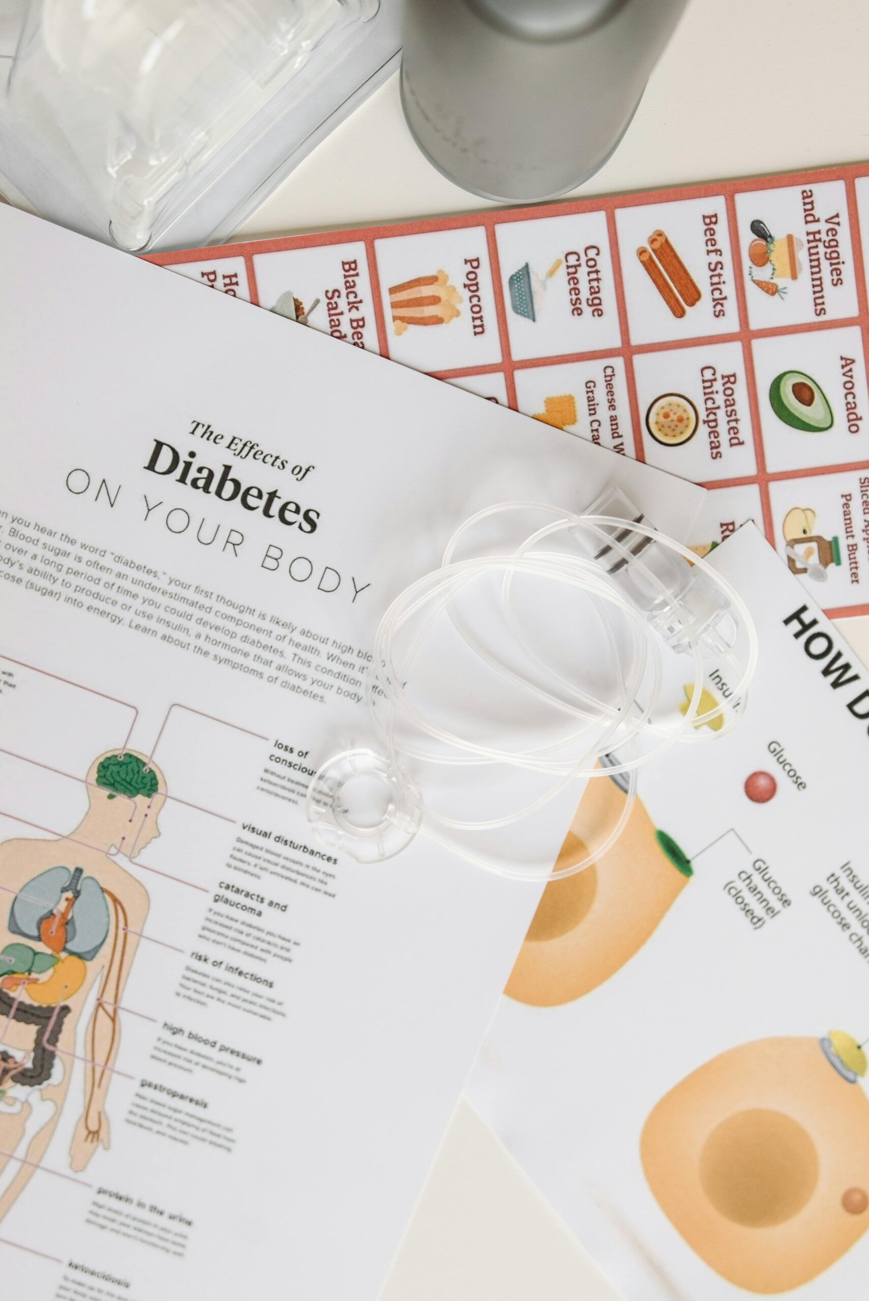
4. Visuals Are Not Just Decoration—They’re Information Delivery Systems
Still using stock images of “Doctor shaking hands with smiling patient”?
It’s time for an intervention. Today’s pharma marketing materials need visuals that do more than just look nice, they need to educate.
Additionally, consider infographics for MOA (mechanism of action), brief pharmacokinetics, pharmacodynamics, iconography for side effect frequency, or even illustrations of patient journeys.
Example: A psoriasis brand used a visual “before-and-after” timeline alongside real patient stories. It helped dermatologists visualize progress, and sell the benefit, without a single data table.
5. QR Codes, Microsites, and Augmented Magic
In a world of AI, VR, and 5G, your brochure should be more than paper.
Consider hybrid marketing collateral—where offline materials connect users to deeper digital experiences.
Add QR codes that link to explainer videos, dosing calculators, or patient testimonials. Or maybe build a microsite where pharma reps can personalize information by specialty.
Clever case study: A paediatric cough syrup used an AR (augmented reality) app. When the parent scanned the brochure, a cartoon lung appeared and “breathed easier” as the narrator explained the mechanism.
Sales? Let’s just say—FABULOUS.
6. Compliance: The Elephant in the Waiting Room
Creativity in pharma is like dancing in a minefield. You want to look like you are bold—but you can’t mislead. So always work hand-in-hand with your medical-legal-regulatory (MLR) team.
Because nothing kills momentum like a brochure caught in approval purgatory.
Smart move: Create a “design sandbox” pre-approved by MLR. That way, you know the imagery, tone, and formats that are kosher, before you waste weeks designing your magnum opus of a leave-behind.
7. Test It Like You’d Test a Drug
Note that, even the most beautiful collateral can flop if no one reads it. So, test it—on reps, on doctors, even on your sceptical uncle. If they pause, scratch their heads, or say “What’s this actually about?”—congratulations, you’ve found your weak spots.
True tale: A biotech firm ran A/B testing on two brochures—one dense with trial data, one simplified with pull quotes and icons.
The simpler one outperformed the original by 68% in rep usage.
8. Keep It Short, Smart, and Shareable
Finally, remember: less is more.
Also, you don’t need to include every study, every endpoint, or every last milligram. Your job is to open the door to a conversation, not deliver a monologue.
Plus, shorter brochures are easier for reps to carry, easier for HCPs to skim, and easier to adapt into digital formats.
Too Long; Didn’t Read?? : The Prescription for Perfect Pharma Collateral
✦ Audience-first always. Customize for who’s reading.
✦ Design matters—ditch the data dump.
✦ Plain language beats jargon any day.
✦ Visuals educate—not just decorate.
✦ Digital integration is no longer optional.
✦ Compliance is your BFF, not your buzzkill.
✦ Test, tweak, and trim mercilessly.
In the end, pharma brochures design isn’t about pushing pills, it’s about building trust, one well-designed panel at a time. And if you can make your audience pause, smile, and actually read? You’ve done more than just market—you’ve connected.
Now, isn’t that the best medicine?
Read more on completing this preparation a full circle https://uspharmamarketing.com/pills-plots-and-profits-mastering-storytelling-in-pharma-sales/


Leave a Reply